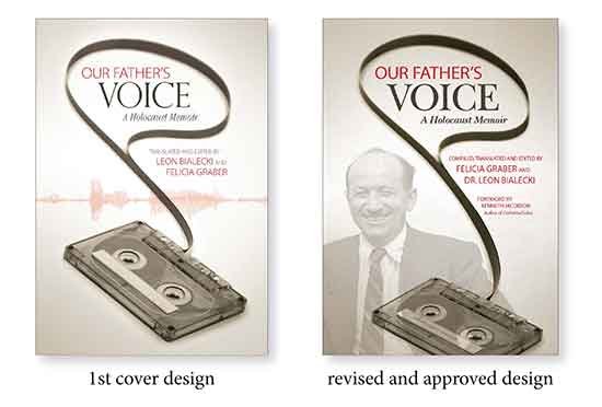
 Cover and interior book design for Our Father’s Voice began with a call from author Felicia Graber. She and her brother. Dr. Leon Bialecki, spent many years of transcribing, translating, and editing their father’s interviews about his experiences during the Holocaust. The interviews with Salomon Lederberger were originally recorded in 1981. Felicia had turned them into a book and wanted me to design the cover and interior pages.
As we discussed cover ideas, I was curious and asked, “What media was used to tell your father’s story?” Felicia said all the interviews were recorded on cassette tapes. This was an “aha” moment. I would search for a cassette tape (stock photo) for the cover image.
The process: I found a sepia-tone cassette photo on Shutterstock.com. Sepia tones were perfect colors for this memoir because they had an archival feel. The photo had a portion of the recording tape pulled out to form a loop. This area seemed like a natural place to put the book title, but the loop was too small. Photoshop to the rescue. I copied and outlined the tape loop to a new layer. Now, I could use Photoshop’s warp tool to stretch and manipulate the shape. It took several tries before the title typography fit within the space.
Next, I added a speech recognition graphic behind the cassette to reinforce the key word “Voice.” My partner, Gary, and I felt that this was the finishing touch and a strong layout. However, when Felicia showed this cover design to her brother, he wanted to see a photo of their father instead of the speech graphic.
Solution: I scanned a pre-WWII war photo of Felicia’s father at the highest resolution and fixed a number of scratches, dust, and imperfections. I placed the image on a separate layer in Photoshop, outlined and ghosted it back so that the cassette tape remained strong in the forefront. However, adding the extra layer affected everything in the layout!
I rotated the cassette tape angle and move it down, stretch the tape loop, and reshape it again to wrap around the photo. I also had to tweak the placement of the title, subtitle, and authors’ names. One last subtle detail completed the cover: I added Salomon Lederberger’s name to the write-in space on the cassette tape. When Felicia and her family saw this revised alternative, they unanimously approved the cover design.
Felicia is a wonderful client. She was very involved and receptive to any design suggestions. It was extremely gratifying to help her accomplish her goal—to create a legacy of her father’s voice.
See more book covers on our portfolio page.


