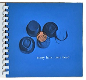
Looking back at a 1958 design book, 27 Chicago, I noticed some timeless design messages that still apply today.
 First, what was 27 Chicago? it was a series of self-promotional books that predated current “source books,” such as Workbook.com. The 1958 spiral-bound book highlighted 27 Chicago designers, illustrators, and typographers. Art directors and art buyers were the target market. I inherited five volumes from my dad when he cleaned out his office many years ago.
Each designer had four pages: A right-hand page was an opening or teaser. The following two-page spread showcased the designer’s work, and included contact information. The fourth page was blank except for photography and printing credits. Each one of these books / this series of books is a nice collection of vintage design. Although the artwork looks dated now, many of the designers were quite expressive. Here are a few of my favorite examples (including the style of using lower case typography).
 “many hats…one head” (this was the headline on the first page in upper and lower case)
“A designer wears many hats; one day that of a specialist in packaging; the next that of an expert in corporate identity; then the one of a designer of printing, or books, or annual reports, or exhibitions. Each of these activities is based upon the same talent—the ability to see a problem in relation to a client’s needs, and to solve it in terms meaningful to the public.” —Bruce Beck Design
“clients like to bring their problems here”
“people who want to sell goods like to work with designers who know marketing…that’s why they come to 646 no. michigan ave” —Charles Bracken (the original punctuation with no caps or periods)
“Although we are at a time when the word creative is used by anyone from a supermarket clerk to a machine-tool salesman, certain design directors and art buyers still find it difficult to find a designer capable of accomplishing a logical, appropriate job. All the verbalizing that can be brought to bear on the unconvincing or uninteresting job will not in any way improve its visual qualities. Good graphics ultimately must speak for themselves. Sound typography and the proper selection and arrangement of symbols are the province of the designer and it is only logical that he must have an intimate knowledge and interest in the client’s problem to execute this choice. Direct contact between the two is an essential. If you have a product or a service that you feel can be best be presented by an honest, direct and appropriate treatment, I would welcome the opportunity to show you my samples.” —Larry Klein
“Planning, thinking, solving” —Franz Altschula
Today, designers voice this same message—good design identifies and solves problems. Do you agree? Let’s continue the conversation.
By the way, 27 Chicago ceased in 1991, but you can find a 10-minute video of the books online. https://vimeo.com/45324415


